You’ve stared at your analytics long enough to know the pattern.
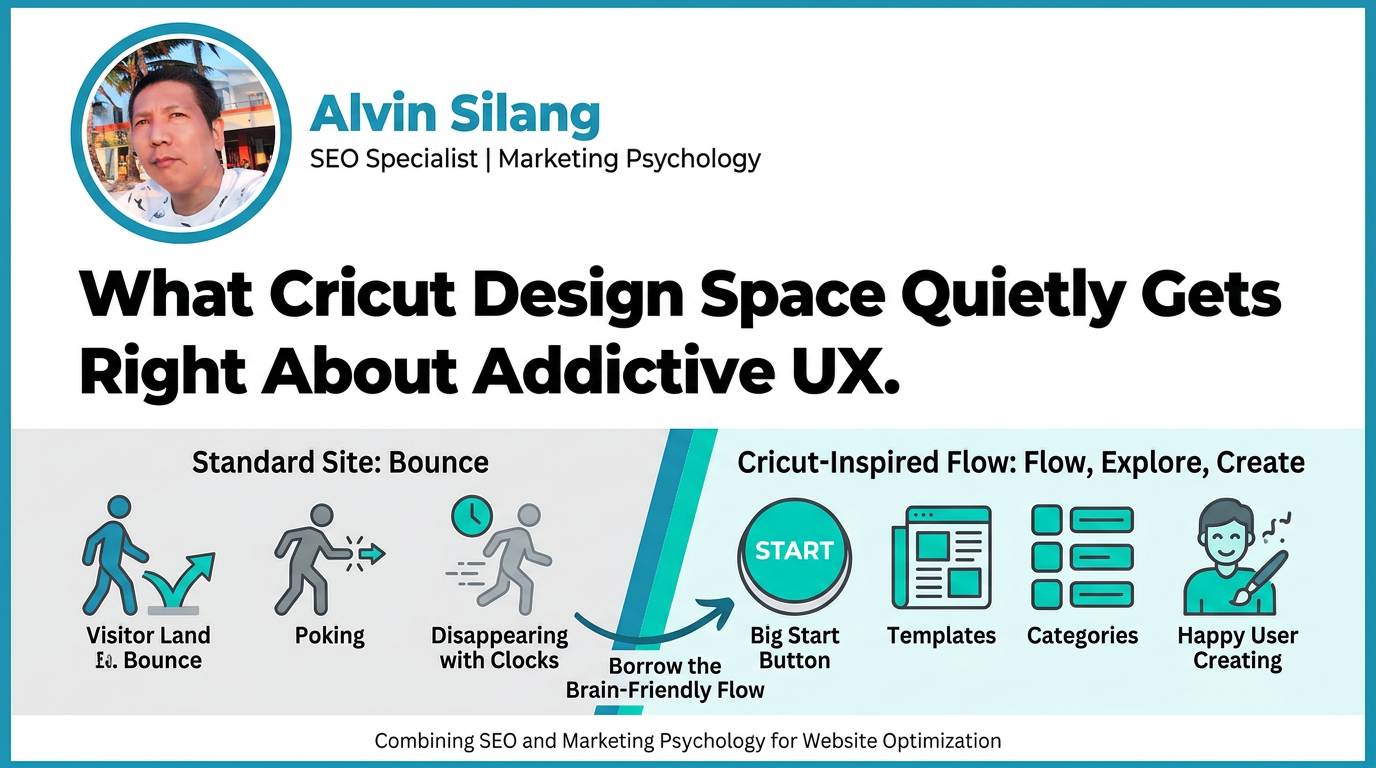
Visitors land on your site, poke around for a minute, maybe two, then disappear.
Meanwhile, apps and tools like Cricut Design Space can keep non‑technical users happily clicking, exploring, and creating for hours. No elaborate tutorial, no 40‑minute webinar—just a clean interface and a flow that “feels right”.




That gap isn’t just about design taste. It’s about how well the experience matches how the human brain likes to process options, reduce risk, and feel small wins. And you can borrow a surprising amount of that from Cricut Design Space for your own website and content.
Table of Contents
Why Cricut Design Space Is So Weirdly Sticky
If you watch a new Cricut user open Design Space for the first time, you’ll notice something: they almost never freeze.
They don’t see a blank, intimidating interface.
Instead, they see:
- A big, obvious way to “start a new project”
- A feed of ready-made project templates
- Familiar categories like “Cards”, “T‑shirts”, “Home Decor”
From a marketing psychology perspective, Cricut Design Space reduces decision fatigue and uncertainty in the first few seconds. You don’t have to figure out the whole tool. You just have to decide: click a template, or click New.
Your website visitors need the same thing.
On high‑intent pages (home, services, key blog posts), people shouldn’t have to think, “Where do I start?” They should see one or two safe, obvious next steps that feel like progress, not commitment.
Ask yourself for each key page:
- What is the “Start a New Project” equivalent here?
- What is my version of the template library—pre‑built answers, examples, or paths that reduce thinking?
If users hesitate, they leave. Cricut’s stickiness starts by making starting absurdly simple.
The Template Feed: Turning Overwhelm Into Momentum
Open Cricut Design Space and the first screen is a wall of ideas.
You see:
- Large, visual thumbnails
- Titles like “Birthday Card”, “Iron‑On Tote”, “Wall Quote”
- Quick labels: Free, Premium, Beginner, etc.
This is a masterclass in using choice architecture and cognitive fluency to keep people moving.
Here’s what’s happening, and how to apply it to your site:
- Show don’t tell with visual examples
Design Space doesn’t start with a manual. It starts with examples. On your website:
- Replace abstract copy like “We create custom strategies” with tiles like “SEO Case Study: 218% Traffic Growth” or “Local SEO Package: Service Businesses”.
- On blog category pages, use visual cards with a clear image, title, and a short benefit-driven line: “Guide: Get your first 1,000 organic visitors”.
- Label difficulty and commitment
Cricut tags projects as beginner, intermediate, advanced. That tells the brain: You can do this. On your site:
- Mark guides by level: “Beginner Guide”, “Advanced Playbook”, “Checklist”.
- Offer clear time expectations: “3‑minute read”, “Video: 7 min”, “Step‑by‑step template”.
- Cluster content by goals, not just categories
Cricut groups things into user goals: Gifts, Apparel, Home, etc. Do the same:
- For SEO content, cluster by intent: “Get more traffic”, “Fix SEO issues”, “Improve conversions”.
- On services pages, group offers around outcomes: “More Leads”, “More Sales”, “Better Visibility”—not your internal service names.
You’re not just organizing content. You’re lowering cognitive load and nudging users into an easy first win.
The Canvas: Why Controlled Freedom Keeps Users Creating
Once you pick a Cricut project, you land on the canvas.
It feels open—you can drag, resize, change text—but it’s also quietly constrained:
- There’s a grid, hinting at alignment.
- Tools sit in logical clusters (shapes, text, layers).
- You can always undo.
This is guided exploration, and it’s gold for website UX.
On a high‑value page (like a product, service, or calculator page), you want visitors to feel in control without getting lost.
You can borrow the canvas pattern like this:
- Use clear, persistent structure. Keep your main navigation, breadcrumbs, and page layout consistent so users always know “where they are on the canvas”.
- Offer safe “tinker zones”.
Think:
- Pricing calculators users can adjust without entering email
- Interactive checklists they can tick without signing up
- Before/after sliders on case studies These mimic Cricut’s low‑risk experimentation. People get to play with your value.
- Make undo (or backtracking) obvious.
In Design Space, Undo/Redo are always visible. On your site:
- Keep filters removable with a single click
- Let users expand/collapse long sections without losing their place
- Avoid forms that wipe all data after a small error
When people know they can’t “break” anything, they explore more—and the more they explore, the more chances you have to convert them.
Micro-Interactions: The Small Hits of Dopamine You’re Probably Missing
Cricut Design Space feels responsive even on slow connections. Every click gives you some signal:
- A button depresses and changes state
- A loading spinner appears where your eye expects it
- A project shows a quick preview or highlight when hovered
Those tiny cues are micro‑interactions. They give the brain constant feedback: Yes, your action registered. You’re moving forward.
Neglecting them on your website is a silent conversion killer.
Here’s where to apply Cricut‑style micro‑interactions on your key pages:
- Buttons and CTAs
- Add a slight color shift or shadow on hover
- Use a brief loading state with text like “Sending…” after form submission
- Change the button to “Sent” or “Request received” with a small checkmark
- Forms
- Validate fields in real time (green check, red hint text)
- Show progress on multi‑step forms: “Step 2 of 3: Your Details”
- Replace generic errors with specific, soft language: “Looks like the email is missing an @ symbol.”
- Navigation and content blocks
- Highlight the current section in a sticky table of contents
- Use subtle reveal animations for sections as users scroll—nothing flashy, just enough to signal progress
These are not visual “tricks”.
They address a simple psychological need: to know that our actions matter. When each interaction on your site feels acknowledged, people stick around longer and complete more steps.
Default Settings: How Cricut Nudges Behavior Without Feeling Pushy
When you start a Cricut project, certain settings are pre‑selected:
- Recommended material size
- Common cut settings
- Smart placement of design elements on the mat
You can change them, but the defaults are optimized for the most common, successful outcome.
This is the default effect in action: humans rarely change defaults, especially in unfamiliar territory. Use that power ethically on your website to guide users toward high‑value actions.
Ways to apply this:
- Pre-select the lowest friction, most helpful path.
- On a contact form, default the inquiry type to the most common, not the most profitable.
- Pre‑check “Email me a copy” instead of “Subscribe me to everything we send”.
- Set smart content defaults.
- For filters on a blog, show “Most helpful” or “Editor’s picks” first, not just “Newest”.
- On a pricing page, highlight the plan most people actually choose with “Most popular—best for growing teams”.
- Default to clarity over complexity.
- Collapse advanced options behind a link (“Advanced settings”) instead of overwhelming new users.
Used well, defaults reduce friction and make decisions easier. Used aggressively, they feel manipulative. Later in this series we’ll unpack where the ethical line sits and how to stay on the right side of it.
Progress Indicators: Why Cricut Makes You Feel “Halfway There” Fast
Cricut projects move through clear steps:
- Choose or design your project
- Prepare your material
- Load the mat
- Press Go
Design Space reflects this structure:
- Step-wise prompts
- Visual cues when you’ve completed a step
- A sense of “you’re almost there” when you reach the Make screen
This is classic goal‑gradient psychology. The closer you feel to finishing, the more motivated you are to finish.
On your site, you can tap this by:
- Structuring long content into visible steps.
Instead of a 2,000‑word wall of text, format it as:
- Step 1: Diagnose the problem
- Step 2: Choose your path
- Step 3: Implement the quick win
- Showing progress in any multi‑step process.
- Quote builders: show “25%, 50%, 75% done”
- Onboarding flows: display upcoming steps and tick off completed ones
- Giving early, easy wins.
- Start tools with a quick discovery: “Based on 3 questions, here’s your SEO priority.”
- In guides, give a 5‑minute action in the first section (“Fix this title tag today”) before deep theory.
The brain remembers how far it’s come, especially when you reflect that progress visually. More progress felt, more conversions earned.
What to Steal From Cricut Design Space for Your Next Optimization Sprint
You don’t need a design app to apply these patterns. You can start with your existing website and content:
- Define your “Start a New Project” action for each key page. Make it visible, low‑risk, and compelling.
- Create a template-like content block. Add a section of ready‑made paths: “I want to… Get traffic / Fix SEO / Improve conversions”—each linking to a specific guide or service.
- Add two or three micro‑interactions where friction is highest. Start with forms and CTAs.
- Review your defaults. Ask: do they help users succeed, or just help you? Adjust anything that leans too hard toward your benefit.
- Turn one long, important page into a step-by-step journey. Restructure it around a clear progression with visible steps and early wins.
When you think like a tool designer—not just a marketer—you naturally build pages that respect how people decide, explore, and commit.
And once you see what Cricut Design Space is doing to keep regular users in a flow state, you stop wondering why your bounce rate is high.
You start designing web experiences people actually want to stay in.