You know people want what you’re selling. They click through from Google, they start your checkout or lead form… and then they disappear.
You tweak button colors, trim fields, throw in more badges. Conversions barely move. The problem usually isn’t the offer or the traffic.
It’s that your page doesn’t feel as safe as handing a check to a real person.


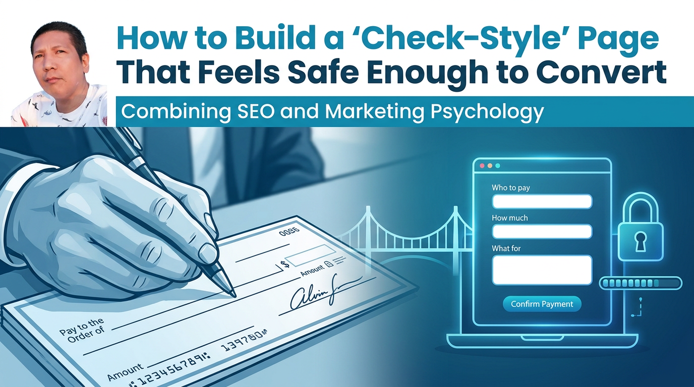
Writing a check is one of the most trust-sensitive actions people take. Yet most users do it on autopilot, with no anxiety. That process is a goldmine for designing pages that feel simple, guided, and low-risk enough to complete.
This is how to turn that “write a check” experience into a conversion framework for your website.
Table of Contents
Why a Check Is the Perfect Conversion Model
Think through what happens when you write and hand over a check:
- You know who you’re paying.
- You know exactly how much you’re paying.
- You know what for (rent, invoice, school fees).
- You follow a familiar, step-by-step format.
- You get a record (your checkbook stub or bank statement).
- You trust that if something’s wrong, you can cancel or dispute it.
All of those map directly onto what a user’s brain needs to feel safe converting online:
- Clear counterpart → Who am I dealing with?
- Clear amount → What exactly am I committing to?
- Clear purpose → What am I getting in return?
- Predictable process → Am I on the right track at every step?
- Proof and confirmation → Will there be a record I can refer to?
- Reversible risk → What happens if something goes wrong?
Your “check-style” page works when it answers these questions in order, with no friction or ambiguity.
Step 1: Make the “Pay to the Order Of” Crystal-Clear
On a physical check, the first big field is who you’re paying. There’s zero doubt.
On many websites, this is where trust begins to leak:
- Generic or vague brand names with no supporting context
- Tiny, low-contrast logos
- No clear legal entity, address, or ownership info
- Checkout pages stuck on a generic subdomain with different styling
You fix that by making the counterpart obvious and consistent.
Practical moves:
- Mirror your brand identity across the funnel Same logo, colors, typography, and tone from landing page → form → checkout → thank you. Your brain treats consistency as a trust shortcut.
- Add a small “You’re in the right place” microcopy line
Above the form or payment section, use a short reassurance:
- “You’re checking out with [Brand], the same team behind [flagship product].”
- “Secure payment to [Legal Company Name].”
- Show your real-world footprint
Near the bottom or in the footer of high-intent pages:
- Full company name and registration line
- Physical city or office location
- Link to About / Team or “Why trust us?” page
That’s the online equivalent of seeing the business name printed on the check stub and knowing exactly who’s on the other side.
Step 2: Treat Price Like the Amount Box on a Check
When you write a check, the amount appears twice: numerically and in words. That redundancy prevents errors and fraud—and calms the payer’s brain.
Most sites do the opposite:
- Surprising fees appear only at the last step.
- Prices shift with vague labels like “estimates” or “from.”
- Taxes, shipping, or “processing” get added in tiny gray text.
Those tricks might bump short-term revenue but wreck long-term trust and SEO performance (users pogo-stick away, reviews suffer, repeat business drops).
Make your amount box as explicit as a check:
- State the final price twice.
Near the CTA and again in a brief breakdown:
- “You’ll pay: $49 today.”
- “Total due now: $49 (no additional fees).”
- Expose every component before the final click.
Use a clean mini-breakdown box:
- Product: $39
- Tax: $3.51
- Shipping: $6.49
- Total today: $49.00
- If pricing is variable, define the range and rule.
Instead of “From $49,” use:
- “Most customers pay between $49–$79, based on [simple criteria]. You’ll see your exact price before you pay.”
Psychologically, clarity of cost lowers perceived risk. You’re mimicking that double-written check amount that leaves no room for surprise.
Step 3: Label the “Memo” Line With Their Real Goal
The memo line on a check answers, in plain language, what this payment is for.
Online, users often don’t see that answer where it matters most—right next to your final CTA. They see jargon:
- “Premium Plan – Monthly Access”
- “Business Tier License”
- “Comprehensive Solution”
None of those match the story in their head.
Psychology-wise, you want goal congruence: the action they take on your page should read like a natural continuation of the goal they walked in with.
Turn your memo line into a benefit line:
- Next to the final button, restate the outcome:
- “Payment for: 1-year access to [Course Name] + templates”
- “Booking: 60-minute strategy call for [Your Business Name]”
- “Order: Website teardown video + action checklist”
- Reflect their language, not internal labels.
Use the keywords and phrasing that brought them here (from your SEO research, as covered in earlier articles in this series). For example:
- Search term: how to write a resume → Memo-style line: “Order: Done-for-you professional resume tailored to your target role.”
That little line snaps their intention and your offer into alignment so the purchase feels obvious.
Step 4: Turn the Form Into a Familiar Check Layout
Checks are intimidating in theory—but visually simple:
- Short, predictable number of fields
- Standard left-to-right, top-to-bottom order
- Grouped by meaning (payee, date, amount, memo, signature)
Your forms should feel the same—especially when they handle payment or sensitive data.
Borrow the structure, not the paper:
- One primary column, not a maze. For most funnels, a single, vertical column of fields beats two- and three-column layouts. Your user’s eyes can “flow” down the page exactly like they do a check.
- Group fields by purpose.
Separate sections visually:
- Contact details
- Billing info
- Order details
- Optional extras Use short subheadings like “Where we’ll send your receipt” or “Card details” to anchor each block.
- Ask only for what you’d need to complete a check-equivalent.
Every extra field is a micro “why do you need this?” moment. Only collect data that:
- Impacts fulfillment
- Impacts security / compliance
- Directly improves their experience
- Use inline microcopy instead of walls of text.
Place helpful, 6–10 word hints under or inside fields:
- “Use the email where you want confirmations.”
- “We’ll never share your phone number.”
You’re designing a “mental template” as familiar as filling out a check: short, clear, left-to-right, top-to-bottom, no surprises.
Step 5: Give Them a Built-In Receipt and Escape Hatch
When you hand someone a check, you keep a record: the stub, a photo, or the bank statement. And you know you can cancel or dispute if needed.
Online, people look for the same two things before they pay:
- A clear sense of the record they’ll have
- A clear sense of what happens if they change their mind
If they don’t see both, they hesitate or open a new tab to “think about it” (and rarely come back).
Bake this reassurance into your page:
- Spell out what they’ll receive immediately after payment.
Right beside “Place order” or “Book now”:
- “Immediately after payment you’ll get: – An email receipt – A summary of your order – A link to manage or cancel your subscription.”
- Use plain-language guarantee terms.
Avoid legalese. Examples:
- “If you’re not happy within 14 days, reply to your receipt email for a no-questions-asked refund.”
- “Cancel any time in your account dashboard—no calls or explanations required.”
- Show where they can view or change their status. Link to “Manage membership,” “Billing settings,” or “My purchases” in your navigation and on the thank-you page.
From a neuromarketing perspective, this reduces perceived loss. People feel they can reverse the decision if needed, so they’re more willing to proceed.
Step 6: Use Microcopy to Narrate Each Step Like a Bank Teller
If you’ve ever opened a bank account or written your first check, someone probably talked you through it:
- “Write the date here.”
- “Put who you’re paying on this line.”
- “Sign at the bottom right.”
That narration lowers cognitive load. Online, most high-intent pages are silent. Forms just sit there.
Your page converts better when it talks like a calm bank teller.
Where to add “narration” microcopy:
- Top of the form:
- “This takes less than 2 minutes.”
- “3 short steps: details → payment → confirmation.”
- At step boundaries:
- “Next: Secure checkout. You can still review your order before paying.”
- Around sensitive fields:
- “We only use this to verify your identity.”
- “Stored securely. We never see or share your full card number.”
- On the final button itself:
- “Pay $49 and get instant access.”
- “Book your 60-minute call for $129.”
You’re constantly answering the unspoken questions: Where am I? What happens next? Is this safe? The more you can answer in 10–15 clear words, the smoother the path to conversion.
Step 7: Borrow Real-World Signals of Legitimacy, Not Gimmicks
A check carries subtle legitimacy signals:
- Bank logo
- Routing and account numbers
- Anti-fraud patterns and holograms
Your website can use its own version of those signals—without tipping into fake scarcity or manipulative tricks (which we covered in depth in the scarcity article earlier in this series).
On a check-style page, you’re aiming for “quiet confidence,” not hype.
Concrete ways to show you’re real:
- Security and compliance icons near payment fields, but only if they’re genuine and relevant (SSL, PCI phrases, well-known processors like Stripe or PayPal).
- Specific social proof near the point of decision:
- “4,327 orders processed securely since 2018.”
- “Trusted by small businesses in 23+ countries.”
- Contextual testimonials that match the user’s situation:
- Place one short quote next to the final CTA: “I was nervous about buying online, but the process felt as safe as paying my local accountant.”
Use these as calm reassurances, not as loud, flashing badges. Overstated trust signals trigger skepticism; understated, specific ones soothe it.
Your visitors already know how to write a check. They’ve done it for years without thinking.
When your high-intent pages mimic that same structure—clear counterpart, clear amount, clear purpose, familiar layout, built-in record, and a safe escape hatch—you’re not “persuading” people harder.
You’re removing the fear that something will go wrong.
Build one key page this way—your main checkout, your lead-gen form, or your booking page. Watch what happens to completion rates once the page finally feels as safe as signing your name on a line you already trust.