You’ve stared at your pricing page so many times it’s starting to blur.
You tweak the numbers, rename the plans, add one more feature row. But conversions barely move. Then you land on a tool like Originality.ai, notice how easy their pricing feels to understand, and wonder: “What are they doing that I’m not?”
That’s the right question. Their layout isn’t an accident. It’s built on a handful of neuromarketing principles that make the brain say, “This looks fair. I know what to choose. I’m comfortable paying.”




You don’t need their exact design or even their business model. You need the psychology underneath it.
Table of Contents
Why some pricing pages feel “easy” while yours feels risky
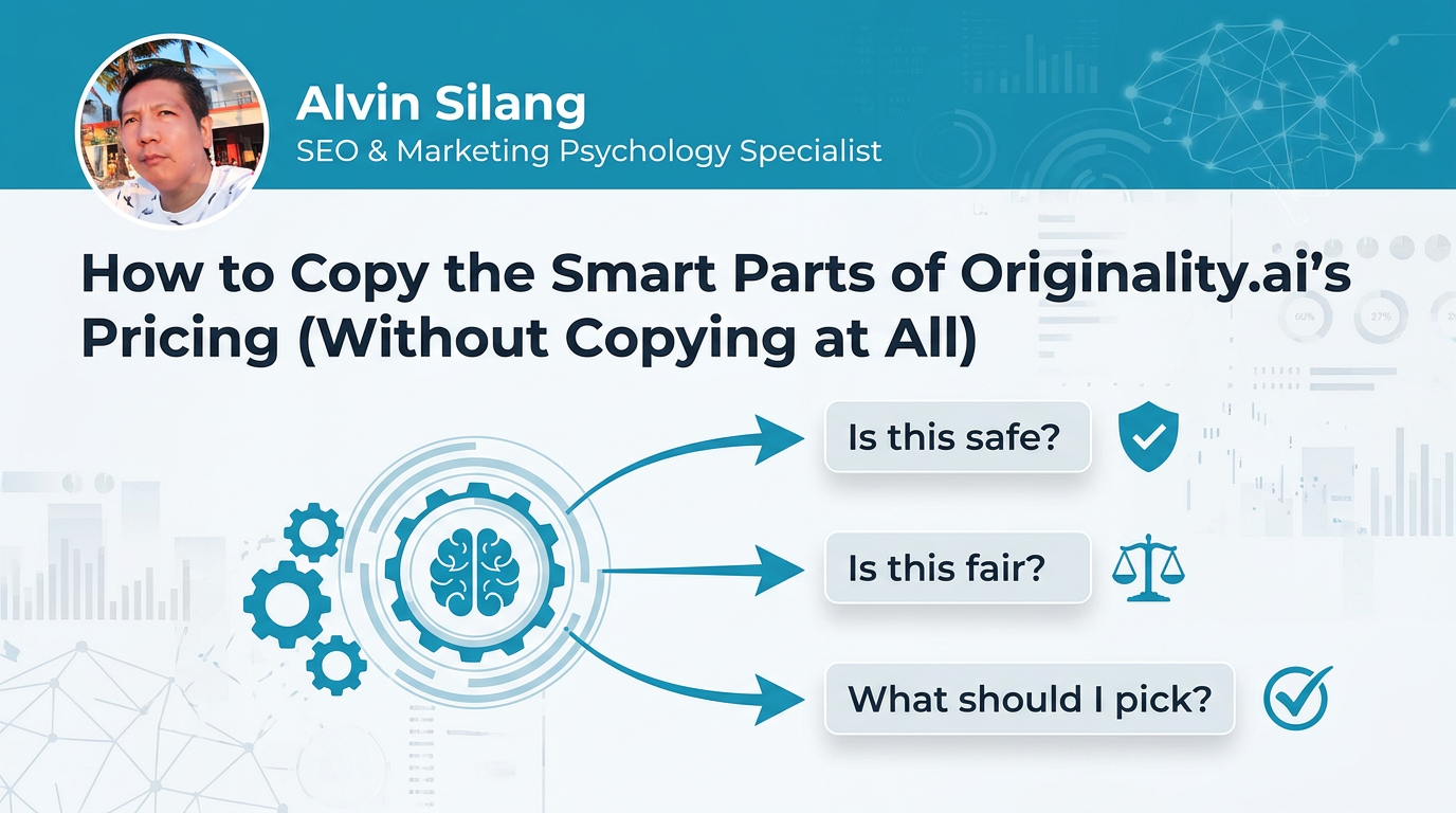
When someone lands on your pricing page, they’re not just comparing numbers. They’re silently asking three questions:
- “Is this safe?” – Will I regret this? Am I being tricked?
- “Is this fair?” – Am I overpaying vs. what I get?
- “What should I pick?” – Just tell me the smart choice.
Originality.ai’s pricing (and other high-performing SaaS pages) answer those questions visually before the visitor even reads every word.
If your page is underperforming, you usually have one of these problems:
- Too many plans, too many rows, too much thinking.
- Feature tables that don’t highlight the real value.
- CTAs that feel pushy or vague instead of specific and safe.
- No clear “default” choice, so users stall or leave.
The fix is not a redesign for its own sake. It’s baking buyer psychology into each element.
What Originality-style tiers quietly do to a prospect’s brain
Take a close look at how tools like Originality.ai structure their plans:
- A small number of clear tiers (not 7 slightly different options).
- One tier visually highlighted as the “recommended” choice.
- A logic to the jumps between tiers: more usage, more features, or both.
This taps into three core principles:
1. Choice reduction
The brain hates excessive choice. Research shows that fewer options often increase conversions because people feel more confident.
How to apply it:
- Aim for 3–4 plans maximum.
- If you have more, group them (e.g., "Individual", "Team", "Enterprise") and hide deep detail behind “View full comparison”.
2. The “Goldilocks” effect
When you show three options, the middle one often becomes the default. It feels like a safe, not-too-big, not-too-small choice.
Originality-style layouts:
- Place the main plan in the middle.
- Give it a label like “Most Popular” or “Best for Agencies”.
- Slightly emphasize it visually (border, background, badge).
The user feels nudged, not forced.
3. Fairness framing
Price gaps that look random trigger doubt. Price gaps that match obvious value feel fair.
Instead of “$19, $39, $99” for no clear reason, you want:
- “X credits per month” → “More credits, higher price”
- “1 user” → “Up to 5 users” → “Unlimited users”
The brain can connect the increase in value to the increase in cost.
Using price anchors so your plans feel like a good deal
On many SaaS pricing pages, one number does a quiet but critical job: it makes everything else look reasonable.
That’s the anchor.
Examples of anchors you’ll see on an Originality-style page:
- A high monthly option shown next to a discounted annual price.
- An Enterprise plan with “Contact sales” that visually sits far to the right.
Psychologically, the user thinks, “Compared to that number, this other one looks fair.”
How to build smart anchors into your pricing
- Use a visible “worst deal” Show a clearly inferior option (e.g., monthly billing) next to a clearly better one (e.g., annual billing with 20–30% off). This makes the “smart” option feel like a win.
- Let your top tier justify your mid tier If your middle plan is $49 and your top is $129, the $49 feels modest in context. Without the top plan, $49 might feel high.
- Anchor with value language, not just numbers
Add copy like:
- “As low as $0.03 per check”
- “Less than one coffee per week for peace of mind” Unit pricing turns an abstract SaaS bill into a tangible bargain.
Avoid fake anchors: don’t cross out a price you never really charged. That feels manipulative and undermines trust.
Turning your features table into a persuasion engine
Originality-style pricing pages don’t win because they list more features. They win because they prioritize and label features the way buyers think.
This taps into cognitive fluency: the easier information is to process, the more true and trustworthy it feels.
Step 1: Group features around outcomes, not internal labels
Instead of a scattered list of 15 bullets, create 3–5 clear groups such as:
- Accuracy & Reliability
- Collaboration & Workflow
- Security & Compliance
- Support & Onboarding
Then place individual features under those headers. This mirrors how your buyers justify a purchase: “We’re paying for reliability and security, not just one more SaaS.”
Step 2: Highlight what changes between tiers
When everything has a checkmark, nothing stands out.
Make it visually obvious what you get more of as you upgrade:
- Use bold text or subtle color for upgrade-only features.
- Add microcopy like “Only in Pro & Agency” next to key benefits.
- For usage limits, align numbers vertically so the jumps are scannable.
Step 3: Translate features into risk-reducing benefits
Don’t stop at “Unlimited scans” or “Team seats”. Show what that means:
- “Unlimited scans – never worry about overage fees.”
- “Audit history – prove compliance to clients and stakeholders.”
This language reduces perceived risk, which is often the real barrier to conversion.
CTAs that pull, not push: microcopy that feels safe
Originality-style pricing often uses CTAs that do three things well:
- Tell you exactly what will happen.
- Reduce fear of commitment.
- Match the visitor’s decision stage.
Compare these two buttons:
- “Buy Now”
- “Start Free Scan – No Card Required”
The second one:
- Clarifies the action (start a scan).
- Lowers friction (free; no card).
- Feels like a reversible step, not a trap.
Where to add safety cues
- Primary CTA buttons
- “Create Free Account – 10 Scans Included”
- “Start With Basic – Upgrade Anytime”
- Below the price
- “Cancel with one click in your dashboard.”
- “No long-term contracts. No setup fees.”
- Near plan comparisons
- “Not sure which plan? Start with Basic and we’ll recommend a switch when you’re ready.”
These lines tap loss aversion in a positive way: you show the user what they won’t lose (money, freedom, control) by trying you.
Handling “what if I pick wrong?” with plan-switch psychology
A common invisible objection on pricing pages:
“What if I choose the wrong plan and regret it?”
If you don’t address this, people procrastinate. Originality-style pages soothe this with flexible language and simple rules.
Make upgrades and downgrades feel painless
Add explicit copy like:
- “Upgrade or downgrade anytime. Changes apply on your next billing cycle.”
- “We’ll credit unused days if you move to a higher plan.”
Place this near the plan grid, not hidden in terms.
Show the path, not just the destination
Use a small line under each plan label to hint when it’s right for someone:
- “Starter – Best if you’re just testing the waters.”
- “Growth – For teams running checks weekly.”
- “Agency – For high-volume, client-facing work.”
This taps self-identification: users choose based on who they see themselves as, not just numbers in a table.
A simple checklist to refactor your pricing page this week
Here’s a practical way to reverse-engineer what works on Originality-style pricing and apply it to your own site without copying visuals or wording.
Walk through your pricing page and ask:
- Do I have a clear “default” plan?
- One plan visually highlighted.
- Label like “Most Popular” or “Best for [segment]”.
- Are there too many choices?
- 3–4 core plans only.
- Advanced or custom options tucked behind expandable details.
- Does the price structure look fair at a glance?
- Logical jumps in value vs cost.
- Unit-based framing if it helps (per user, per scan, per project).
- What’s my anchor?
- Visible “worst deal” (monthly vs annual, or single-plan vs bundle).
- Highest tier makes mid tier feel reasonable, not cheap.
- Can a skimmer understand differences in 5 seconds?
- Grouped features (3–5 themes).
- Clear visual emphasis on upgrade-only perks.
- Do my CTAs reduce fear?
- Specific action (“Run First Check”, “Start Free Trial”).
- Safety phrases nearby (no card, cancel anytime, easy plan changes).
- Do I answer the “what if I’m wrong?” objection?
- Short explanation of upgrades/downgrades.
- Plain language guarantee or refund policy if you offer one.
Run this checklist, make the changes, and then watch two metrics over the next few weeks:
- Click-through rate on your primary pricing CTA (e.g., to signup or checkout).
- Plan mix (more users choosing the plan you actually want them on).
When those improve, you’ll know your page is no longer just listing prices. It’s doing what the best examples like Originality.ai do: guiding the brain calmly toward “yes” instead of leaving visitors stuck at “maybe later.”