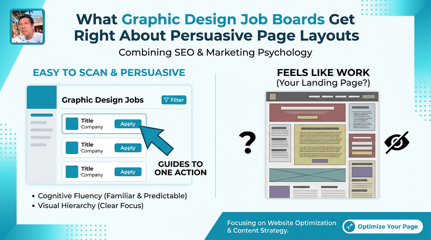
You’ve probably opened a job board for graphic design jobs and thought, “Why does this page feel so easy to scan… while my own landing page feels like work?”
Same amount of text. Same browser. Totally different experience.
That difference isn’t an accident. The best design job boards are built to guide tired, distracted designers to the one action that matters: apply to a job. That’s the same behavioral challenge you face with your SEO landing pages and long-form blog posts.




Table of Contents
Why graphic design job boards feel so easy to use
Open Dribbble, Behance Jobs, or WeWorkRemotely on a laptop.
You’ll notice a pattern within five seconds:
- A clear page title that orients you (e.g., “Graphic Design Jobs”, “Remote Design Jobs”).
- Filters and search controls pinned near the top or side.
- A list of jobs that all share the same compact card layout.
- One column that obviously matters more than the rest (job title + company).
Nothing is fancy. But your eyes know exactly where to go.
That “obviousness” is behavioral design at work:
- Cognitive fluency – your brain likes interfaces that feel familiar and predictable.
- Visual hierarchy – bigger, bolder, more contrasted elements get attention first.
- Choice simplification – you see many options, but you’re guided to one next step.
You can borrow all three for your website.
The list layout: why simple vertical stacks convert
Job boards almost never use masonry grids or wild layouts for listings. They rely on a clean vertical list. That’s not laziness. It solves a psychological problem.
Humans scan vertically faster than they scan dense blocks. The vertical list:
- Creates a clear F-pattern or Z-pattern for the eyes.
- Lets users compare options row by row with minimal mental effort.
- Sets up a natural rhythm: scan → pause → click.
Apply this to your SEO pages:
1. Use vertical lists for your core offers
On a service page, instead of three complex columns with icons, try:
- One column list of services.
- Each service as a “row” with: title, 1–2 benefit bullets, CTA (“Learn more”).
This mirrors a job board’s structure: job title, key perks, apply button.
2. Structure blog pages like job feeds
Many blogs dump posts into a grid. That looks pretty but often kills scannability.
Treat posts like job cards:
- Post title as the primary line (larger, darker text).
- Subheadline emphasizing outcome or who it’s for.
- Small meta (date, read time) in low-contrast text.
- A single, consistent “Read more” pattern.
You turn an overwhelming archive into a clean, scrollable list where users can instantly pick their next read.
How job cards use micro-hierarchies to drive clicks
Look closely at a single job card on a site like Dribbble Jobs.
You’ll usually see:
- Job title – largest font, dark color.
- Company name + logo – slightly smaller, medium contrast.
- Location / Remote tag – badge or subtle label.
- Key perks or salary – small icons or short labels.
- Posted X days ago – low contrast, smallest font.
This stack is deliberate. The most decision-driving info is visually loud. Supporting info is quiet.
For your SEO and content pages, create similar micro-hierarchies:
Make the most persuasive line the loudest
On a landing page hero, many brands let the company name or generic slogan dominate.
Borrow the job card logic:
- Primary: Outcome-based headline (the “job title” of your page) – biggest, darkest.
- Secondary: Who it’s for / trust cue (“For B2B SaaS teams…”) – slightly smaller.
- Tertiary: Supporting detail (short benefit list, concise explainer) – normal weight.
- Quaternary: Low-priority details (legal, tiny notes) – smallest, lowest contrast.
You align visual weight with decision weight, which reduces friction.
Treat key benefits like “perks” on a job card
Design job posts know candidates care about salary, remote options, and benefits.
They:
- Group perks near the top or right of each card.
- Use badges or icons for quick pattern recognition.
On your pages, surface your equivalent of perks:
- “Response within 24 hours”
- “No long-term contracts”
- “Case studies in your industry”
Place these near your CTA, visually grouped, in bullet form or labeled badges. You’re speaking to the same risk/benefit calculus that job seekers make.
Filters and facets: what they teach you about intent
Job boards live or die by how quickly you can narrow from 1000+ jobs to 3–5 viable ones.
That’s why filters are so prominent:
- Role (Graphic Designer, UI Designer, Brand Designer)
- Level (Junior, Mid, Senior)
- Location (Remote, Country, City)
- Contract type (Full-time, Part-time, Freelance)
These map to search intent segments.
Do the same for your SEO traffic:
Add intent-based “filters” to content pages
On a long guide, create internal anchors or tabs that act like filters:
- “If you’re a beginner, start here”
- “If you run an agency, skip to this section”
- “Templates: Jump straight to downloads”
You’re not changing the URL like a job board filter, but you’re changing perceived control. Users feel they can tailor the page to themselves.
Segment CTAs the way boards segment roles
Look at how boards split categories: “UX/UI”, “Branding”, “Motion”.
On your site, instead of a single generic CTA, try:
- “For SaaS teams: See SaaS case studies”
- “For Agencies: See agency results”
- “For Local Businesses: See local SEO wins”
This mirrors how job seekers filter by role and seniority. People convert when they see themselves in the option.
Consistency and repetition: why sameness builds trust
Scroll down a job board. Every card looks almost identical.
Same layout. Same typography rhythm. Same CTA placement.
It’s not boring; it’s reassuring. Users understand, after one or two cards, how the system works. Their brain stops learning the interface and focuses on making decisions.
Many websites break this principle:
- Each section has a new layout pattern.
- CTAs jump around in color, size, and position.
- Headline sizes change unpredictably.
That creates small, constant moments of friction.
Borrow the job board discipline:
- Use one card style for all featured services.
- Keep blog teasers visually identical.
- Fix CTA color and style. Only vary label and minor context.
Repetition isn’t laziness; it’s a trust signal. Predictability signals professionalism and reduces the effort required to say “yes”.
Empty space and contrast: the quiet persuasion layer
Graphic design job boards often have a lot of whitespace and very few competing colors.
Psychologically, this:
- Lowers visual noise, which lowers perceived effort.
- Increases signal clarity for key actions (like “Apply”).
- Signals competence (cluttered = amateur, clean = professional in users’ minds).
Practical ways to steal this for your site:
- Give each key section breathing room above and below (40–80px, not 8–16px).
- Limit your primary palette to one primary color (for CTAs/links) plus grayscale.
- Use bold color only for one main action per section.
Think of every job card you’ve seen where the “Apply” button is the only saturated element. Use that discipline for your lead-gen buttons.
How to apply job-board thinking to your next SEO page
Before you mock up or wireframe another landing page or long-form article, run it through this job-board lens.
1. Define the “job seeker” on your page
Ask:
- Who is the primary visitor segment for this page?
- What’s their version of a “dream job” outcome?
Your hero and headings should speak to that outcome first.
2. Turn core choices into a vertical list
Instead of:
- Complex feature tables hidden below.
- Assorted CTAs scattered randomly.
Try:
- A simple, scrollable list of key options (plans, services, articles).
- One clear CTA per row.
3. Create card-like blocks with clear hierarchies
For each offer or article, design it like a job card:
- Primary line: outcome-focused title.
- Secondary line: audience or core benefit.
- 1–3 micro-perks.
- Clear CTA in a consistent corner.
4. Simulate filters with navigation and anchors
Use top-of-page links like:
- “For freelancers”
- “For small teams”
- “For enterprises”
Jump users straight to the part that matters to them.
5. Audit for consistency and whitespace
Ask of each page:
- Do similar elements look similar everywhere?
- Is there one obvious visual path from top to main CTA?
- Does any element shout without earning it?
If not, strip it back until the page feels as scannable as your favorite graphic design job board.
You don’t need to be a visual designer to use these patterns. You’re borrowing tested, behavior-led layout decisions that already work at scale.
And when you start thinking of your SEO pages as “job boards for your offers” — where visitors quickly match themselves to the right next step — you’ll naturally design for how people actually browse, evaluate, and decide.